


Content ITV PRO
This is Itvedant Content department
Learning Outcome
6
Basics of branding and messaging
5
Target audience and segmentation
4
Different marketing channels
3
Understand the structure and meaning of the Mumbai West house pricing dataset
2
Install and configure Seaborn correctly
1
Explain what Seaborn is and why it is used
Previously covered topics :
DataFrames and Series
Data preparation and inspection
Cleaning and transforming data before analysis
Analytical validation before visualization
Visualization using Matplotlib
Hook/Story/Analogy(Slide 4)
Transition from Analogy to Technical Concept(Slide 5)
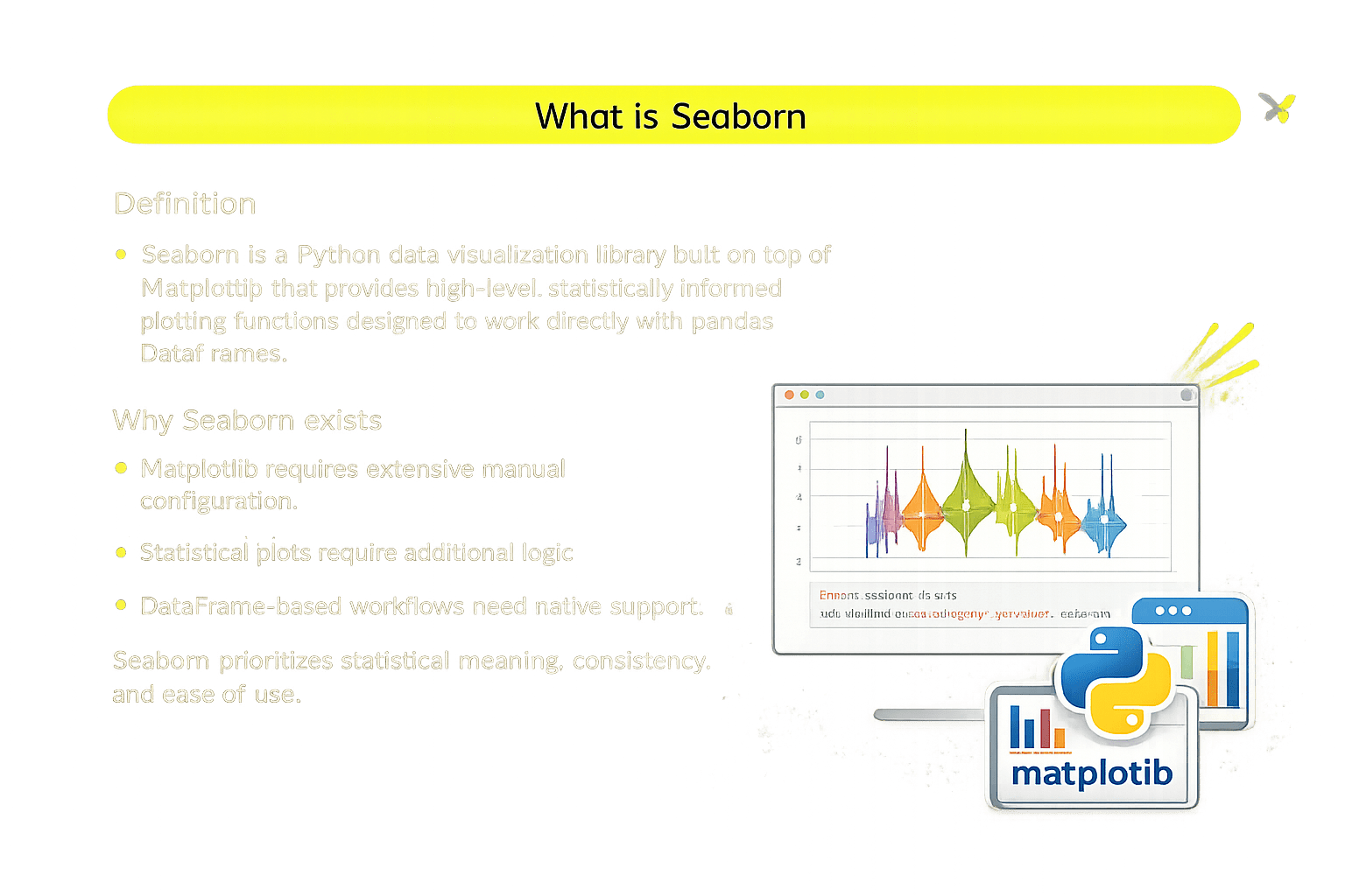
What is Seaborn
Definition
Seaborn is a Python visualization library built on Matplotlib that offers high-level, statistically informed plots for pandas DataFrames.
Why Seaborn exist?
Matplotlib requires extensive manual configuration
Statistical plots require additional logic
DataFrame-based workflows need native support
Installing and Setting Up Seaborn
Explanation:
sns → Seaborn plotting interface
plt → rendering and fine control
Installation
pip install seabornImports
import seaborn as sns
import matplotlib.pyplot as plt
import pandas as pd
Understanding the Mumbai West House Pricing Dataset
This dataset represents Mumbai western-region housing listings for price analysis
Key Columns:
bhk – number of bedrooms, halls, kitchens
type – apartment, villa, independent house, studio apartment
locality – neighborhood information
area – size in square feet
price – numeric price value
price_unit – L (Lakh) or Cr (Crore)
status – ready to move / under construction
age – new, resale, unknown
region – geographic region
Why Use Seaborn Over Matplotlib?
Seaborn is preferred when the goal is to visualize patterns and distributions, not manually assemble plots
Key advantages
Summary
4
Customization enhances clarity and interpretation
3
Each plot type serves a specific analytical purpose
2
Works directly with pandas DataFrames
1
Seaborn simplifies statistical visualization
Quiz
Which Seaborn plot is best for identifying outliers across house types?
A. Line plot
B. Histogram
C. Box plot
D. Scatter plot
Quiz-Answer
Which Seaborn plot is best for identifying outliers across house types?
A. Line plot
B. Histogram
C. Box plot
D. Scatter plot
By Content ITV


