MOXIES.COM
WEBSITE DEVELOPMENT

IN THIS PRESENTATION WE WILL
- Demonstrate the short term changes being made to the Moxie's website to bring e-comm functionality to the forefront
- Present enhanced menu functionality for in-store users
- Present a new look that merges with the brand redesign
E-COMM FOCUSED CHANGES
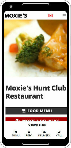
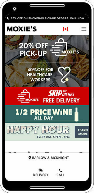
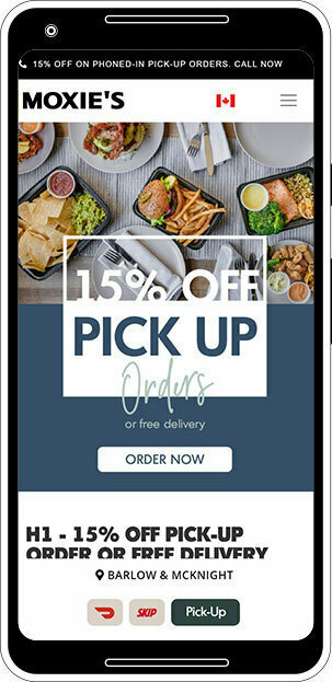
In the last two months the website has gone through several changes, with the end result being a more focused e-comm landing experience
ENHANCED IN-STORE MENU
As stores re-open there will be a requirement to limit touch points for patrons
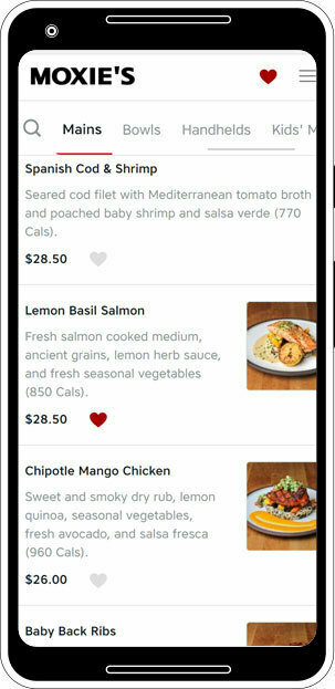
- an infinity scrolling menu will be implemented which can be accessed through the website, or a QR code
- menu will have the capacity to hold images if that is required (potential phase 2)
- an 'add to basket' feature will be added to help people more easily remember their order (potential phase 2)
In the future, we might want to consider a 'pairing suggestion' feature when people add items to their basket, as a way to up-sell without the need for a waitress.
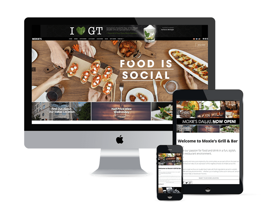
Moxies.com website was built over 5 years ago and has seen multiple re-skinning endeavours lead by numerous individuals
- Average time on site is 1:42
- Average user visits 2.67 pages
- Average user has 1.32 sessions
- 3.1m sessions in the past year
- Attributed SEO value of $2m
The current DRUPAL platform expires November 2021
THE CURRENT MOXIES.COM SITE

Over the years, the demographic has largely stayed consistent, even as website traffic has doubled
- 62% of users are female
- 74% of users are between 25 to 54
- 62% of users are on Safari browser
-
45% of all traffic is organic
- 85% of traffic is mobile or tablet based (this number was 50% when the current website was built)
THE CURRENT MOXIES.COM SITE
The site will simplify intent for users and avoid unnecessary clutter
- be truly mobile first
- reduce blocky aesthetic and embrace elements of the rebrand
- viewport focused with limited need for scrolling - take advantage of social style carousels
- move the user as quickly as possible to the top of a sales funnel
- dispense with vanity stats as indicators of success
THE NEW MOXIES.COM SITE
In order to accomplish this, the site must be seen as a living entity
- artwork must be made to fit the aesthetic and layout of the site
- site changes are created with intent and always follow best practices
- constant A/B testing
- reduce load times on all pages by removing content that is unnecessary to the user journey
THE NEW MOXIES.COM SITE
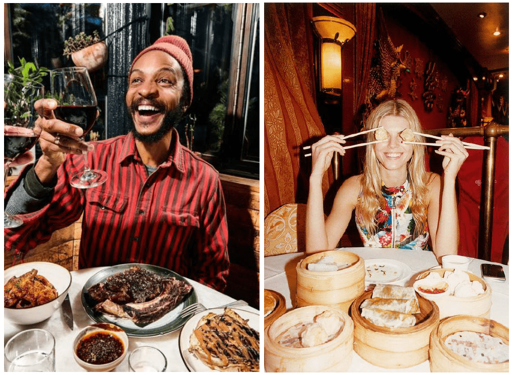
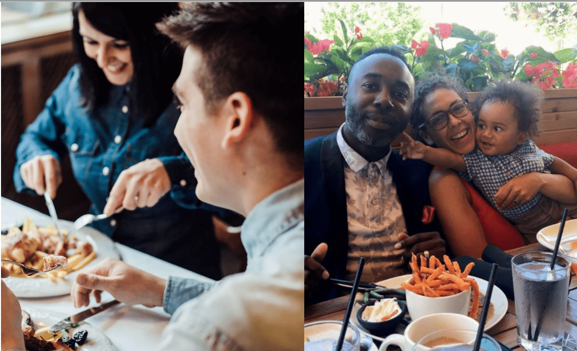
We are particularly drawn to a few elements in the rebrand package
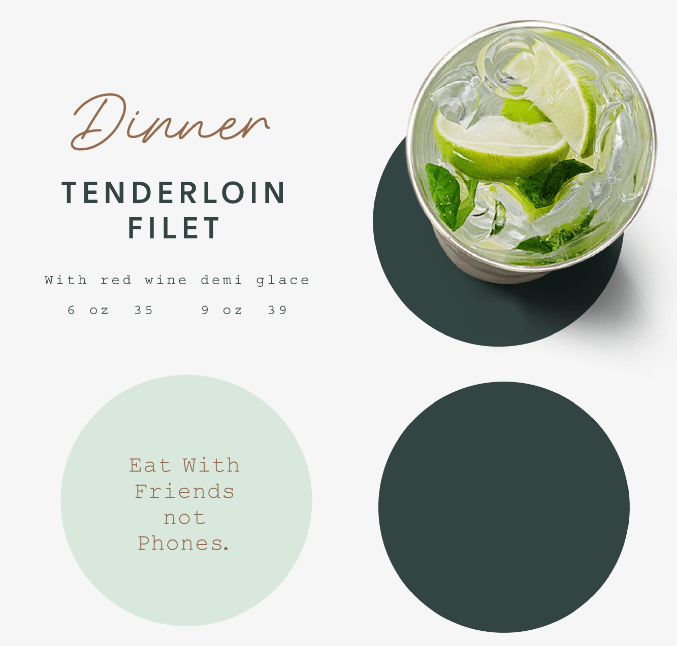
- heavy use of negative space
- circle focus
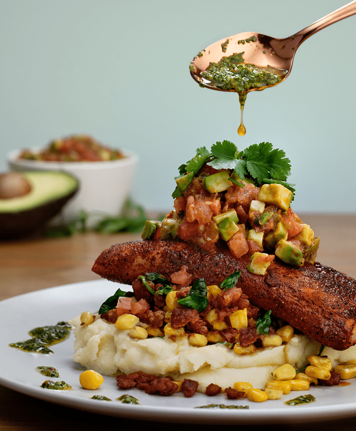
- casual lifestyle photography
- unitary focus of food photography
The one concern we have is the use of a couple of the suggested fonts, as they aren't formatted for web and lack multiple weights
THE NEW MOXIES.COM SITE
THE NEW MOXIES.COM SITE
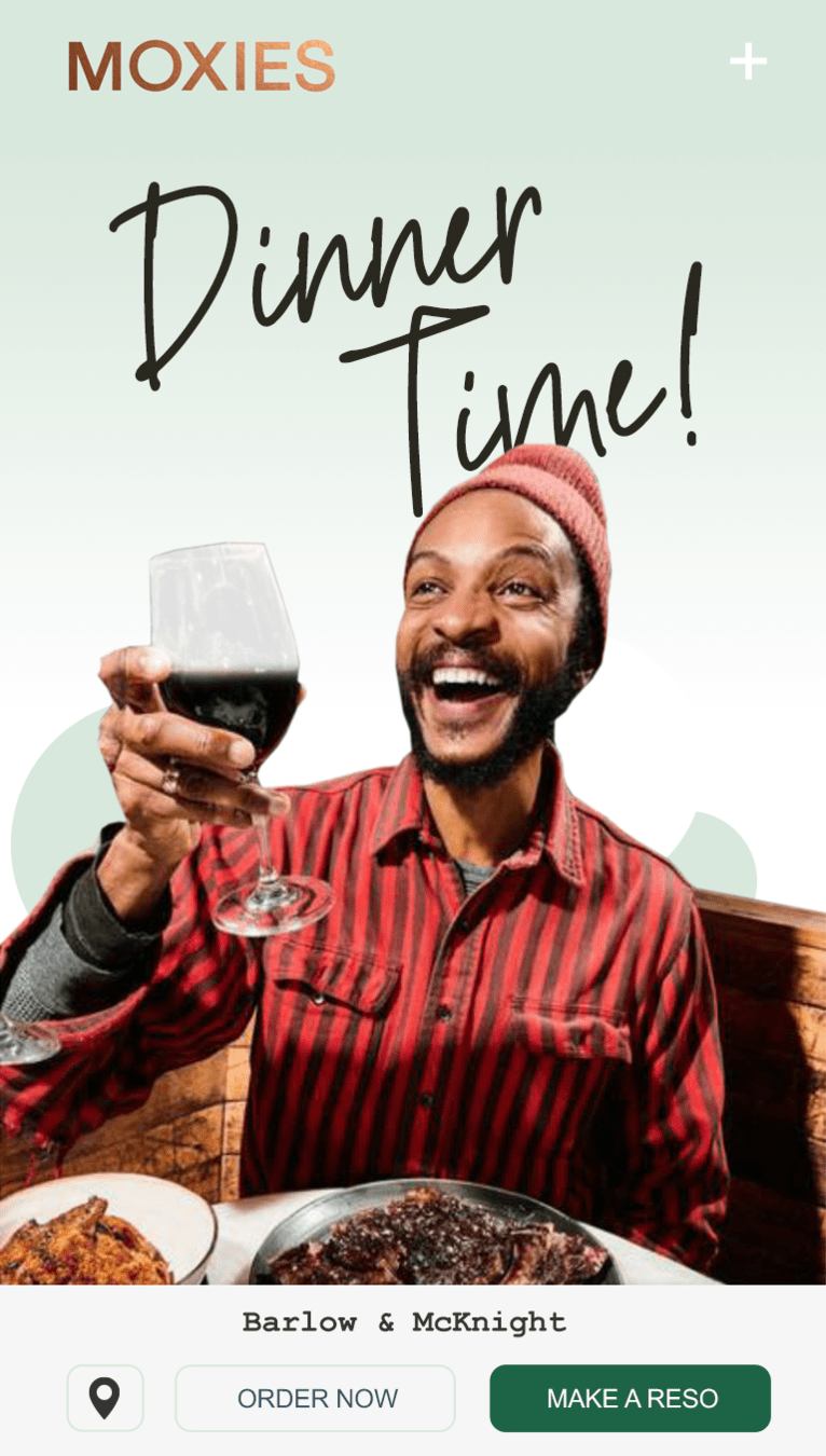
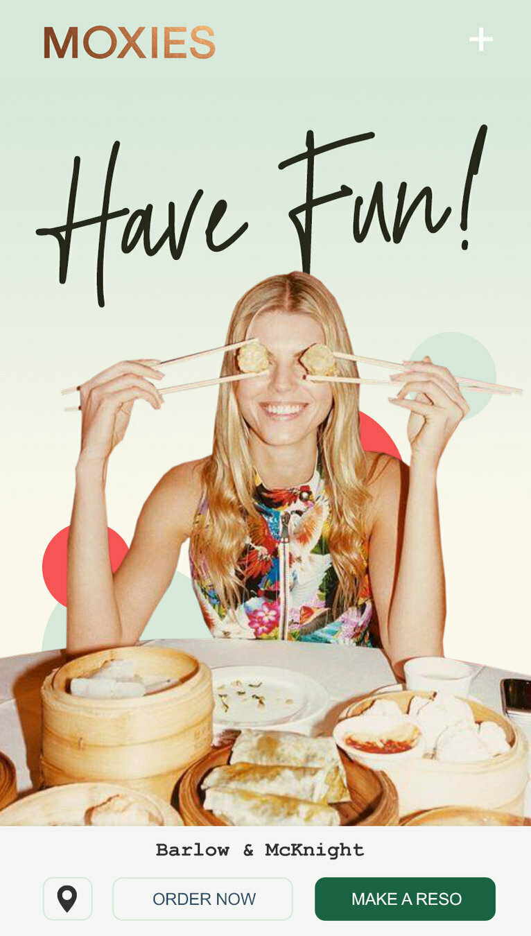
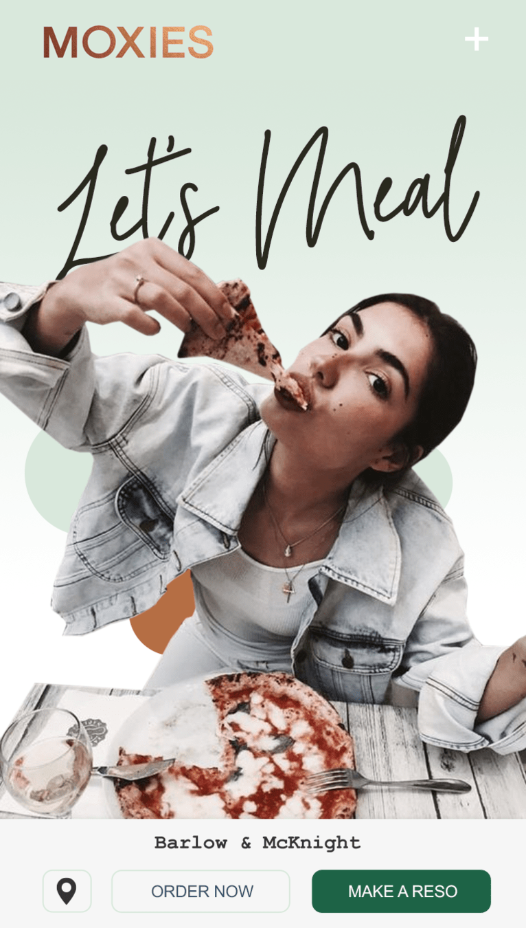
DYNAMIC REVENUE FOCUS
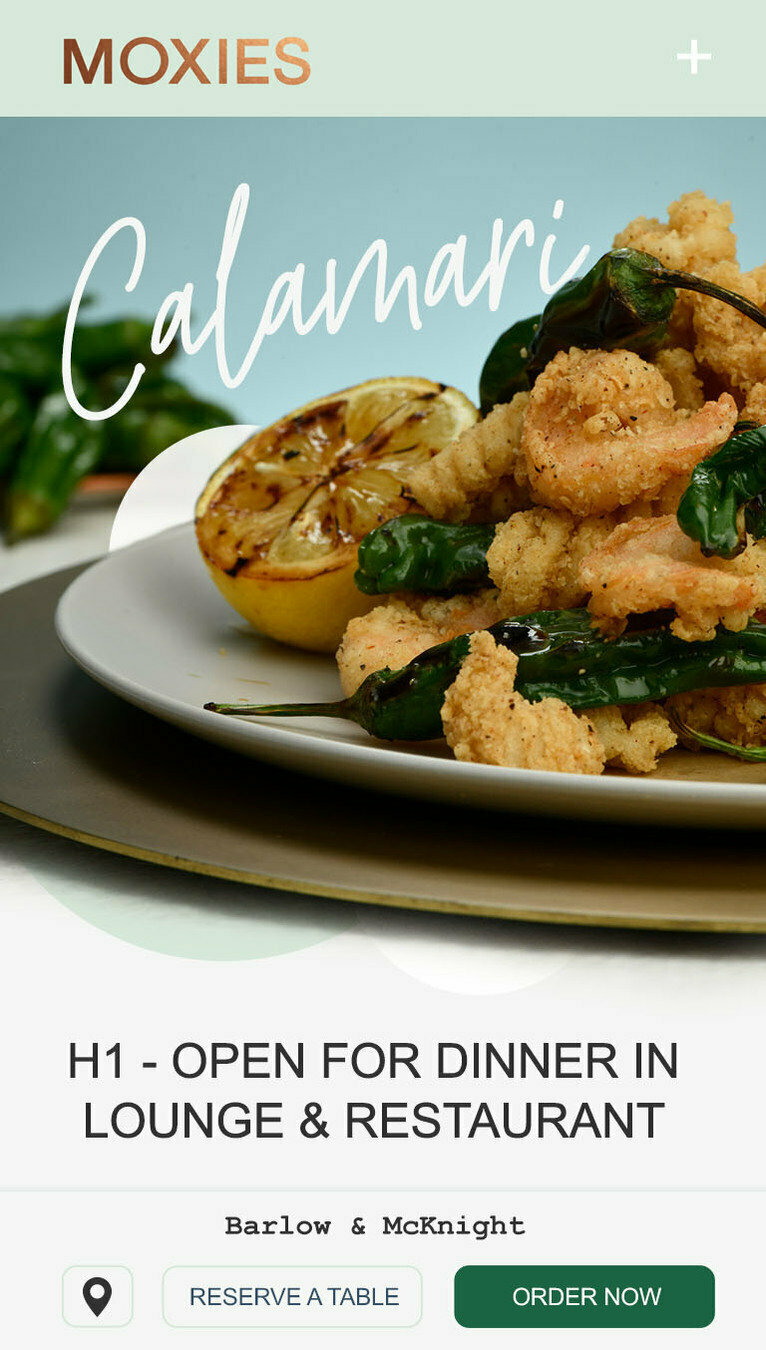
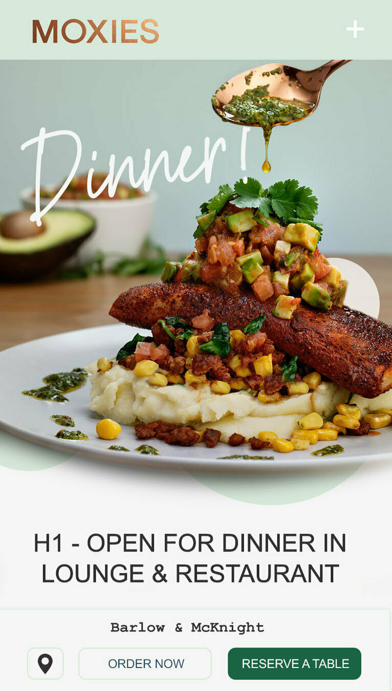
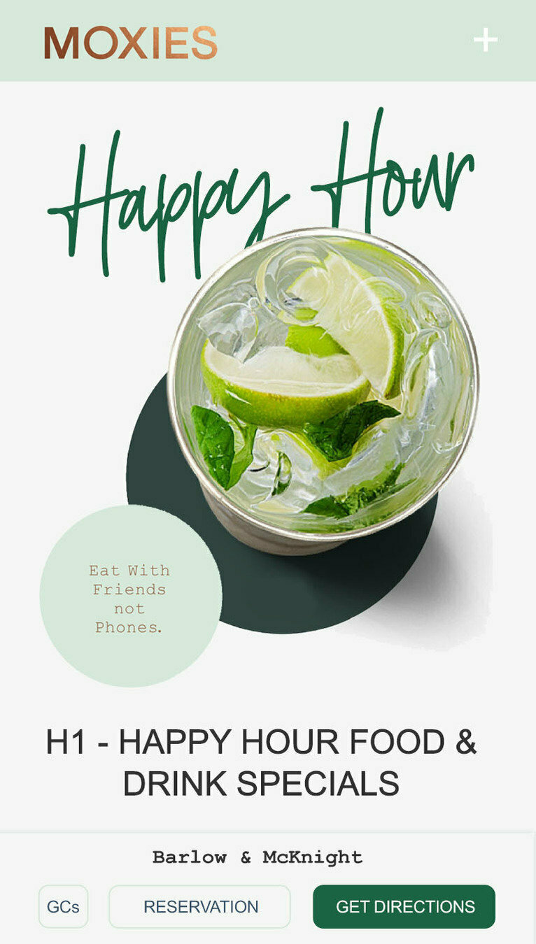
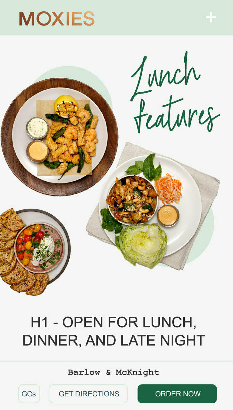
Over 50% of users that visit the site interact with a location page, so we want the site to react with revenue periods, changing the central image, page titles, and the pinned CTA buttons, to best inform the visitor of time-sensitive information/offerings. The entire website experience should be available through the location and menu pages.


Open - 1pm
focus: lunch
1pm - 4pm
focus: happy hour
5pm - 7pm
focus: dinner
7pm - 8pm
focus: dinner
8pm - 11pm
focus: late night
11pm - Open
focus: revenue funnels
DYNAMIC AD FUNNEL
The site should welcome a user with expected creative and an obvious path for consumer success.
If a user clicks on a gift card ad, the landing page will present gift card creative and dynamically adjust the pinned buttons for best execution, even if it's the time of day that lunch should be populating a banner area.
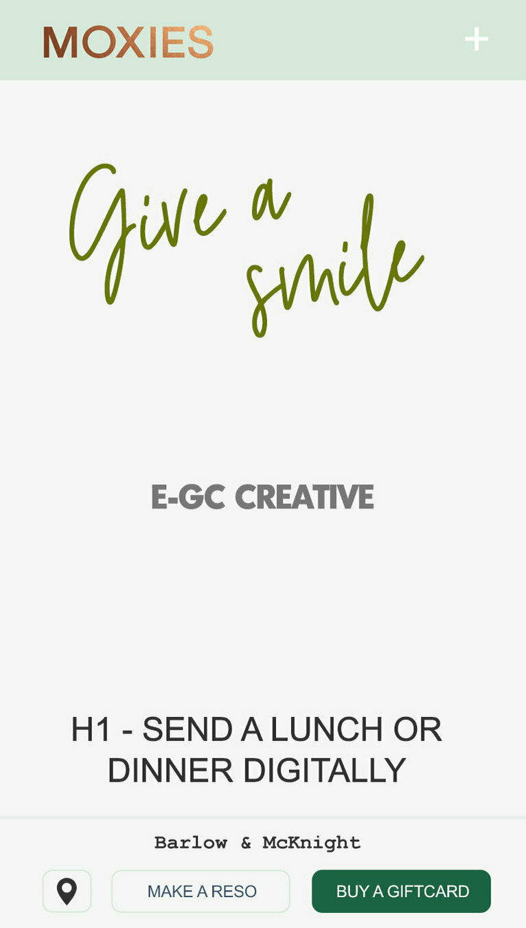
Gift Card Ad
GDN
Gift Card Ad
SOCIAL
Gift Card Ad
SEARCH
CONTROLLED USER PATHS
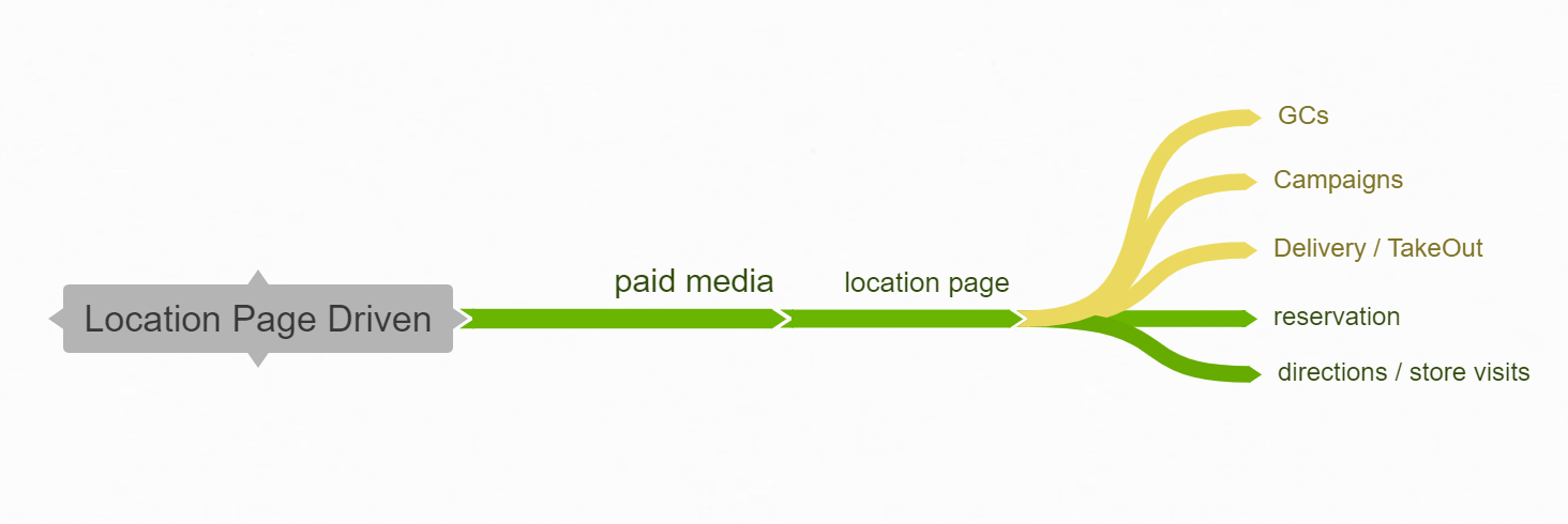
The user journey needs to be of ultimate focus, with a successful top-of-funnel experience no further than 2 clicks, but ideally only 1 click away. Understanding our ideal user journey will assist us in determining the most effective CTAs to pin on the bottom of our pages.

WE WILL TAKE THE BRAND DESIGN AND SUCCESSFULLY MERGE IT WITH A NEW WAY OF THINKING ABOUT THE MOXIE'S DIGITAL EXPERIENCE PUSHING TOWARDS A TRUE E-COMMERCE EXPERIENCE
We do not believe that this requires a new website build, but instead a re-skinning of the current architecture, and the addition of a couple of new features.
PROJECT
1 week
4 weeks
6 weeks
4 weeks
2 weeks
1 week
Ongoing
TIMELINE
8-10 WEEKS DEPENDING ON THE EASE OF DESIGN APPROVALS AND THE AVAILABILITY OF PHOTO ASSETS -- MANY OF THE PHASES CAN BE WORKED ON CONCURRENTLY
WEBSITE REQUIREMENT GATHERING PHASE
WEBSITE ARCHITECTING ENHANCEMENT PHASE
WEBSITE DESIGN PHASE
WEBSITE DEVELOPMENT PHASE
WEBSITE APPROVAL AND PRODUCTION RELEASE PHASE
WEBSITE AND DIGITAL BRAND RELEASE
NEW DIGITAL ADVERTISING ROLLOUT
THANK
YOU

deck
By Johan Denooij