Technology Empowerment Team
Form 3 ~ 6 Potential Course
2023-2024
Floor 4 - Computer Room
Mr. Peter
Outline

1
2
Connect to the server
Development and practice
1.1.
Ex14 - Transition
1.2.
Ex15 - Transform
1.3.
Ex16 - Animation
1.4.
Ex17 - Animation
Server
1.
2.
3.
4.
5.
6.
7.
8.
9.
10.
11.
12.
13.
14.
Ex14 - Transition
Move your mouse cursor to the element
Part 1
Ex14 - Transition
Part 1 - Tasks:
Create a folder called
1.
Create a file called under the folder
2.
HTML structure
3.
body {
  margin: 0;
  padding: 0;
  display: flex;
  justify-content: center;
  align-items: center;
  height: 100vh;
}
Tab
Create a <div> element
4.
Tab
Create a <style> element within <head>
5.
Tab
Center every elements in <body> element horizontally and vertically
6.
7.
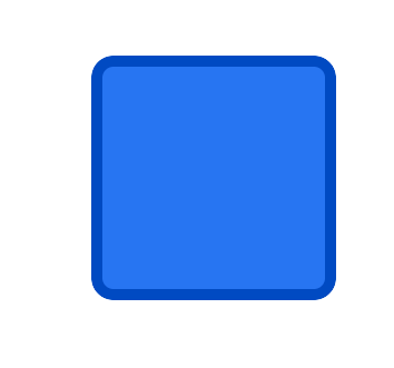
Set the width to 100 pixels
-
Set the height to 100 pixels
-
Set a background color
-
Set a border with specific color
-
border: 5px solid #004ac2;Set a border radius with 10 pixles
-
border-radius: 10px;Ex14 - Transition
Part 1 - Tasks:
Create a folder called
1.
Create a file called under the folder
2.
HTML structure
3.
body {
  margin: 0;
  padding: 0;
  display: flex;
  justify-content: center;
  align-items: center;
  height: 100vh;
}
Tab
Create a <div> element
4.
Tab
Create a <style> element within <head>
5.
Tab
Center every elements in <body> element horizontally and vertically
6.
7.
Set the width to 100 pixels
-
Set the height to 100 pixels
-
Set a background color
-
Set a border with specific color
-
border: 5px solid #004ac2;Set a border radius with 10 pixles
-
border-radius: 10px;Ex14 - Transition
Mouse hover effect in CSS
Ex14 - Transition
Mouse hover effect in CSS
Ex14 - Transition
Mouse hover effect in CSS
Mouse hover
Status 1
Status 2
We need to define two status and let the computer calculate the transition
100px
100px
120px
120px
Ex14 - Transition
Mouse hover effect in CSS
Mouse hover
Status 1
Status 2
100px
100px
120px
120px
div:hover {

}
For the hover effect, we can write the code like above, and set the second status that what properties have changed. Obviously, height and width of the box have changed.
Ex14 - Transition
Mouse hover effect in CSS
Mouse hover
Status 1
Status 2
100px
100px
120px
120px
transition: 0.3s all;And also, we can add the transition to the box and set the transition time between two status within 0.3 second if mouse hover the element
Ex14 - Transition
Move your mouse cursor to the element
Part 2
Ex14 - Transition
Part 2 - Tasks:
Change the background color and border color if mouse hover to the element.
1.
Ex14 - Transition
Move your mouse cursor to the element and click it
Part 3
Ex14 - Transition
Part 3 - Tasks:
1.
div:active {

}
Change the background color, border color and the size of the element
2.
Ex14 - Transition
Move your mouse cursor to the element and click it
Part 4
Ex14 - Transition
Part 4 - Tasks:
Observe the effect and finish it
1.
Ex15 - Tranform
Move your mouse cursor to the element and click it
Part 1
Part 1 - Tasks:
Create a folder called
1.
Create a file called under the folder
2.
Copy everything from the previous exercise and delete meaningless codes
3.
Ex15 - Tranform
Rotate the element if mouse hover and clicked
4.
To rotate a element, we can use transform property and rotate() value with degrees unit
-
transform: rotate( 0deg );Rotate 0 degree
5.
Set the transition of hover effect to be and transition time for click effect
transition: 0.1s all;Transition within 0.1s in all properties
Change the mouse cursor icon if mouse pointing in the element.
6.
cursor: pointer;Part 1 - Tasks:
Create a folder called
1.
Create a file called under the folder
2.
Copy everything from the previous exercise and delete meaningless codes
3.
Ex15 - Tranform
Rotate the element if mouse hover and clicked
4.
To rotate a element, we can use transform property and rotate() value with degrees unit
-
transform: rotate( 0deg );Rotate 0 degree
5.
Set the transition of hover effect to be and transition time for click effect
transition: 0.1s all;Transition within 0.1s in all properties
Change the mouse cursor icon if mouse pointing in the element.
6.
cursor: pointer;Ex15 - Tranform
Move your mouse cursor to the element and click it
Part 2
Part 2 - Tasks:
Instead of using width and height to change the size, and can also use scale in transform property to scale up the element
1.
Ex15 - Tranform
transform: scale( 2 );If we want to mix with rotate and scale in a transform, we can write like this
2.
transform: rotate( 45deg ) scale(2);Scaling 2x bigger
Ex15 - Tranform
Move your mouse cursor to the element and click it
Part 3
Part 3 - Tasks:
Also, we can use translate( x, y ) to offset a element
1.
Ex15 - Tranform
transform: translate( 0, 20px );The order is important if you want to mix with scale, translate and rotate in a transform property
2.
Offset Y axis in 20px
Firstly, we need to offset the element
1.
Rotate the element
2.
Scale the element
3.
Ex15 - Tranform
Move your mouse cursor to the element and click it
Part 4
Part 4 - Tasks:
In animation, transition speed is normally not a linear line, we can define the transition curve of how the effect changed over time
1.
Ex15 - Tranform
Firstly, we need to change the the transition speed to be linear and watch the effect in the browser
2.
transition: .3s all linear;Press in the browser and find the element style properties
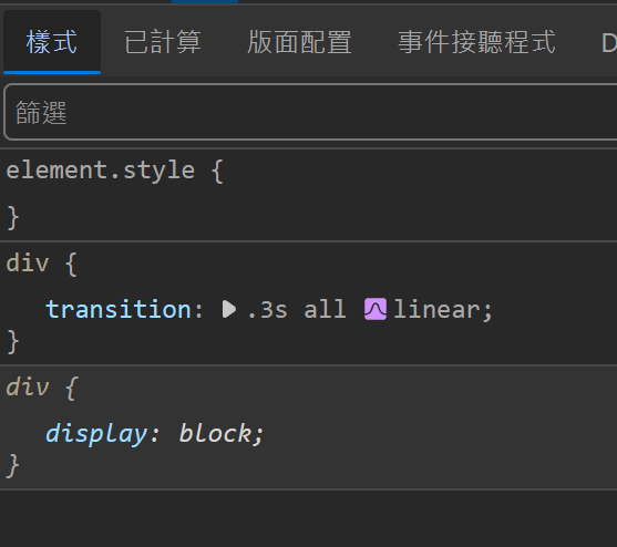
3.
Click the button and see the animation curve
4.
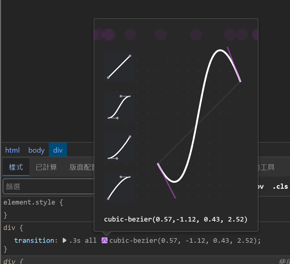
We can drag the curve to change the transition timing function and copy the code to replace the write in our program
5.
cubic-bezier(0.51,-1.59, 0.63, 2.31)To give the transition effect better, we can set the transition time from 0.3s to 0.6s
6.
Part 4 - Tasks:
In animation, transition speed is normally not a linear line, we can define the transition curve of how the effect changed over time
1.
Ex15 - Tranform
Firstly, we need to change the the transition speed to be linear and watch the effect in the browser
2.
transition: .3s all linear;Press in the browser and find the element style properties
3.
Click the button and see the animation curve
4.
We can drag the curve to change the transition timing function and copy the code to replace the write in our program
5.
cubic-bezier(0.51,-1.59, 0.63, 2.31)To give the transition effect better, we can set the transition time from 0.3s to 0.6s
6.
Ex16 - Animation
Part 1
Part 1 - Tasks:
Create a folder called
1.
Create a file called under the folder
2.
Copy everything from the previous exercise and delete meaningless codes
3.
To create a animation in CSS, we need to setup how a animation will play first.
4.
@keyframes name {
  0% {

  }

  100% {

  }
}
Ex16 - Animation
In the program above, the name is the animation name you need to define and the scope in the animation is to define every status of the element during a defined animation time
-
For example, if we need to define a animation called "hello", and this "hello" animation is to change the height of a element, then we can set like this:
-
@keyframes hello {
  0% {
  	height: 100px;
  }

  100% {
  	height: 120px;
  }
}
After we define a animation for rotating, we need to define which element is going to use this animation.
5.
animation: rotating 1s infinite;Apply a animation called "rotating" and the animation time is 1 second, and forever to loop the animation.
Ex16 - Animation
Part 2
Part 2 - Tasks:
Rewrite the keyframes animation, and set that three status will change during the animation, including rotating and scaling
1.
@keyframes rotating {
  0% {

  }

  50% {

  }

  100% {

  }
}
Ex16 - Animation
Ex16 - Animation
Part 3
Part 3 - Tasks:
Observe the animation and change the status in keyframes
1.
@keyframes rotating {
  0% {

  }

  33.333% {

  }

  66.666% {

  }

  100% {

  }
}
Ex16 - Animation
- Transform: translate, rotate, scale
- Background color
Animation effect properties changed:
- Border color
Ex17 - Sun and Earth
Part 1
Part 1 - Tasks:
Create a folder called
1.
Create a file called under the folder
2.
Copy everything from the previous exercise and delete meaningless codes
3.
position: absolute;Ex16 - Animation
Create a <div> and assign a class called "sun" to it
4.
Create a <div> and assign a class called "earth" to it
5.
For the earth <div>, we need to set it as "floating":
6.
transform-origin: 225px;To rotate the earth around the sun, we can set the origin of the earth (The earth size in the example is assumed (50px x 50px)
8.
Offset the earth x-axis -200px by setting the translate in transform property.
7.
Ex17 - Sun and Earth
Part 2
Part 2 - Tasks:
For this part, the answer is as follows:
1.
Ex16 - Animation
<!DOCTYPE html>
<html>
<head>
	<title>Ex17</title>

	<style type="text/css">
		body {
			margin: 0;
			padding: 0;
			display: flex;
			justify-content: center;
			align-items: center;
			height: 100vh;
			overflow: hidden;
		}
		div.sun {
			width: 100px;
			height: 100px;
			background: #ffe14a;
			border: 5px solid #dbbb18;
			border-radius: 50%;
		}

		div.earth {
			position: absolute;
			width: 50px;
			height: 50px;
			background: #2775f2;
			border: 5px solid #004ac2;
			border-radius: 50%;
			transform: translate(-200px);
			transform-origin: 225px;

			display: flex;
			justify-content: center;
			align-items: center;

			animation: rotating 3s infinite linear;
		}

		div.moon {
			position: absolute;
			width: 20px;
			height: 20px;
			background: #b5b5b5;
			border: 5px solid #999;
			border-radius: 50%;
			transform: translate(-60px);
			transform-origin: 72.5px;

			animation: rotating-m 1s infinite linear;
		}

		@keyframes rotating {
			0% {
				transform: translate(-200px) rotate(0deg);
			}

			100% {
				transform: translate(-200px) rotate(360deg);
			}
		}

		@keyframes rotating-m {
			0% {
				transform: translate(-60px) rotate(0deg);
			}

			100% {
				transform: translate(-60px) rotate(360deg);
			}
		}
	</style>
</head>
<body>

<div class="sun"></div>
<div class="earth">
	<div class="moon"></div>
</div>

</body>
</html>
Technology Empowerment Team - Web development
By Mr Peter


